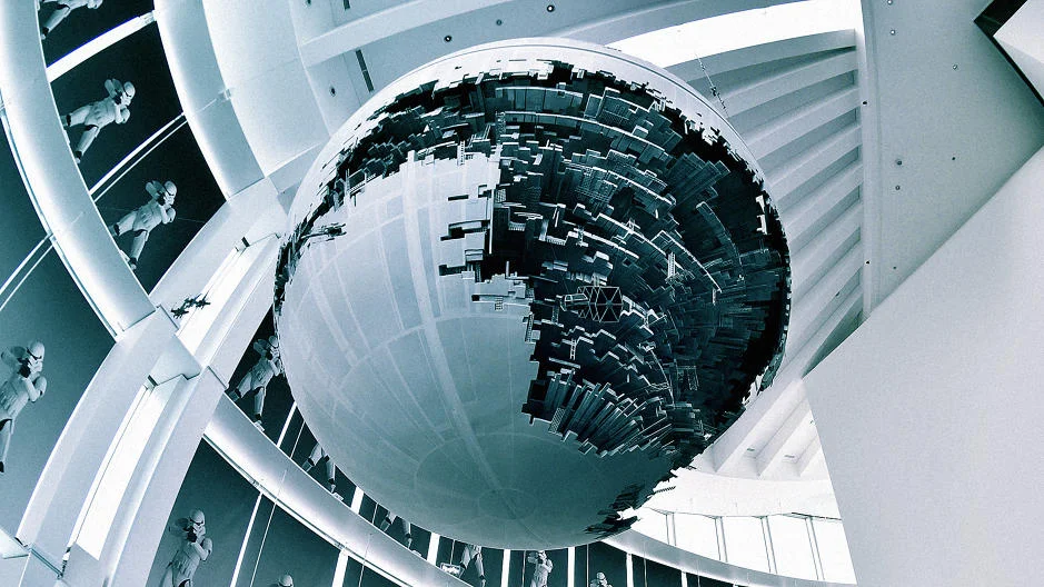
Last week, Google revealed updated renderings of its forthcoming campus. The BIG and Thomas Heatherwick design has seen its fair share of updates since it was first announced in early 2015, a normal occurrence for such a large and high-profile project. This new rendition swaps the building's transparent roof for an opaque canopy. One Co.Design staffer's first reaction to the new, more ominous and compact design? It looks like the Death Star.
George Lucas's planet-obliterating space station is a favorite metaphor for designers and users of buildings. I'm a guilty offender, too. But I want to change my ways. Some buildings do look like the Death Star, but the vast majority that get compared to it do not. And in the rare event that a building actually is perfectly spherical, there are usually so many more apt descriptors than a 40-year-old fictional weapon.

