Behind every successful chef is a well-designed restaurant — is that how the saying goes? The James Beard Foundation, in addition to naming chefs and restaurants at the height of culinary accomplishment, will name its Restaurant Design Awards recipients at its ceremony in Chicago on May 7.
This year, minimal design was out, Biber Architects principal and James Beard Awards Design Committee member James Biber said. Architectural and design trends appearing often in the 2018 submissions included white-painted brick, elaborate light fixtures, dark spaces and salvaged wood — reminiscent of the materials highlighted by last year’s nominees.
“The trend is away from minimal to maximal; away from single-purpose eateries to hybrid multi-activity spaces; and toward both domestically scaled spaces and very large spaces as well,” Biber said.
“Custom ceramics, light fixtures, site-specific art, mosaic tile and branded graphics are appearing in more spaces, as a way to separate a restaurant from the pack,” he said. “And nearly all spaces are working hard to give a diner insight into the personality of the chef, the owner or restaurant’s big idea.”
Here are the finalists in the running for the 2018 James Beard Foundation Restaurant Design Awards:
Otoko, Austin, Texas
Otoko, in Austin, Texas, one of the nominees for the James Beard Award in restaurant design. Photo: Jett Butler
A joint project between FÖDA Studio, Studio MAI, and Michael Hsu Office of Architecture, this miniscule 12-seat Japanese restaurant is tucked away inside the boutique South Congress Hotel. The vibe is Japanese minimalist: Materials used include burned cedar panels, redwood countertops, and copper accents. “These enable the customer to maintain a pure, driven focus on the soft texture and aroma of the food being prepared,” says Milo Garcia of Studio MAI.
De Maria, New York City
De Maria. Photo: Courtesy of De Maria
Less is more for this Nolita space, which caught the JBF design committee’s eye with its simple design. “The jury appreciated the creative use of humble finishes (such as the tile “paintings” above the bar) to strongly brand a space without heavy-handed design,” says committee member James Biber (FAIA, LEED). Designers The MP Shift took their inspiration from the 1960s creative community, and envisioned the space as equal parts imperfection and art.
Daily Provisions, New York City
Daily Provisions. Photo: Emily Andrews
A 600-square-foot annex to the famed Union Square Cafe—“probably the tiniest restaurant that our studio has ever designed,” says David Rockwell, founder and president of Rockwell Group—this all-day bakery is now a destination in its own right. Rockwell aimed to fashion a space that felt like an “extension of [customers’] home or office,” and used brass, wood, and marble accents to convey feelings of warmth and comfort.
abcV, New York City
abcV. Photo: Courtesy of abcV
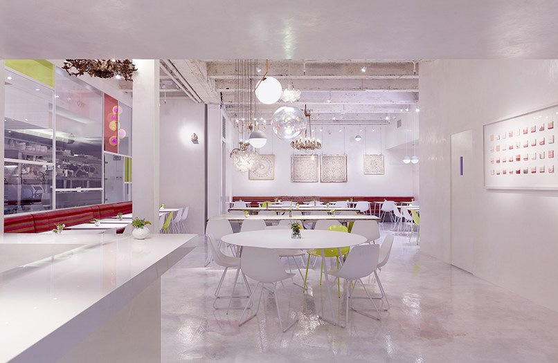
This bright vegetarian restaurant inside ABC Carpet & Home won points for its “cheeriness, elegant curation of objects, and subtle crafting of the space,” says Biber. The restaurant, which was designed by ABC Carpet & Home, was meant to appeal to a broad array of customers. “We imagined a sacred space, embodying the balance of intuitive feminine energy combined with articulate masculine energy,” says Paulette Cole, CEO and creative director at ABC.
In Situ, San Francisco
In Situ. Photo: Matthew Millman
A collaboration between Aidlin Darling Design with a l m project, this street-front space located within SF MoMA marries industrial design and artistic influence. “It’s a space for the confluence of art, food, and culture,” says project designer Adam Rouse. With a sculptural wood ceiling, floating white walls, and exposed steel rods, the restaurant has been designed to engage all senses, with special attention paid to tactility and acoustics.
The Preacher’s Son, Bentonville, Arkansas
The Preacher's Son. Photo: Mark Jackson of CHROMA
This modern Southern restaurant is located in a former church—don’t miss the apse that has been reconfigured as the bar—but the redesign, created by FÖDA Studio and Shears Adkins Rockmore, didn’t just rely on the building’s former use. "We updated Gothic Revival to the contemporary experience,” says Jett Butler of FÖDA Studio. Especially striking are the colorful art glasses by George Dombek, a modern twist on traditional stained glass windows.
Design Icon: The American Restaurant, Kansas City, Missouri
The American Restaurant. Photo: Courtesy of the James Beard Foundation
Receiving the honor this year is the aptly named The American Restaurant, located on the top floors of the Crown Center. Designed by Warren Platner, it has been the inspiration for countless other top-of-the-building restaurants that have followed in the intervening years. Platner described it as, “bridging the contrast in scale between great volume of space and the minute detail of food and tableware, between public gathering and personal intimacy.”


