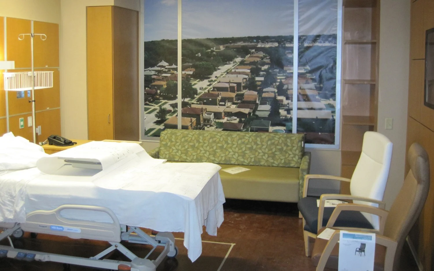
An example of a final patient room after a mock-up (seen in the above image), which utilized final finishes and simulated the view from the room.
Picture the optimistic mood at a new patient unit on the first day of operations, everything shiny and new. That is, until the equipment and accessories arrive and are installed and, much to the hospital administrators’ dismay, don’t fit in the patient room as expected. The heights of the custom millwork do not work well for the nurses. There is not enough clearance to maneuver around the equipment—it’s a logistics nightmare.
Could this have been avoided? Absolutely.
This is precisely why we mock-up patient rooms and other spaces in major healthcare projects and renovations. It helps us to make decisions and avoid costly misunderstandings. It tests our decisions and assumptions in three dimensions.
While considerations such as minimum code-required dimensions and equipment clearances technically work on paper, there is nothing more valuable than simulating the proposed space and demonstrating the difference between minimums and best practices in a tangible way. A trial run of the space at a life-sized scale can further refine the design experience, discovering issues that would be otherwise difficult to realize from traditional drawings. Ultimately, it results in a better space with a better user and patient experience.


