This week marks the 50th anniversary of NeoCon! Stay tuned to our homepage for our coverage of the convention, but in the meantime, these designs offer object lessons on recent trends in commercial design.
#1: Standard Nature
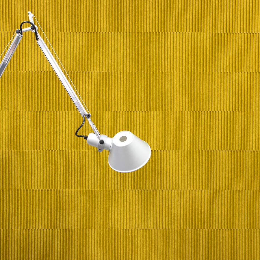
A near-universal characteristic of natural patterns and textures is that they appear random while still possessing an underlying structure. And through repetition or replication, this phenomenon—visible in the way leaves grow or rocks weather—creates diversity. Recently, designers inspired by nature have forgone direct visual references in favor of beautifully varied textures and patterns. FilzFelt’s Ribsy felt wall tiles (seen here) use subtle color variations, available in 50 color options, to enhance their texture.
Courtesy the designer and manufacturer
#3: Working Lounges
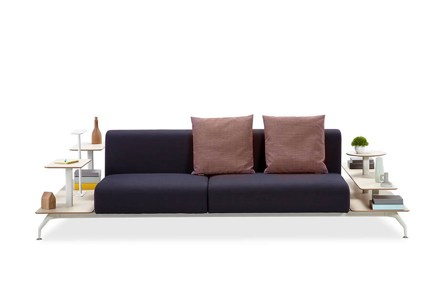
Koleksiyon’s Plan, meanwhile, combines sofas with side and coffee tables to add function to comfortable seating.
#2: Color Fields
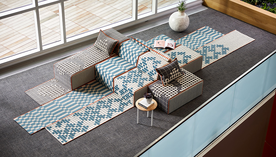
Or it can be bold, as in Patricia Urquiola’s Bandas Space for Haworth, in which the geometries of her Bandas rugs crawl over simple lounge forms like handcrafted pixels.
Courtesy the designer and manufacturer
#4: At Ease
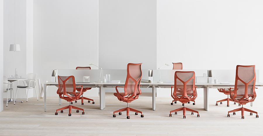
The holy grail of ergonomic design is intuitive adjustment—furniture that anticipates the user’s every move. Herman Miller is the latest to claim an effortless user experience with Cosm, a task chair designed by Studio 7.5 and engineered for fluid movement. Cosm may not work miracles, but it’s an attractive indicator of where desk seating is likely to go: a liberating experience that dynamically adjusts to a sitter’s changing postures. The chair comes in three back heights (including one with total spinal support) and multiple arm options to accommodate a variety of bodies and preferences, and the allover dipped-in-color adds to a seamless, of-the-moment athleisure aesthetic. Whose move?
Courtesy the designer and manufacturer
#5: Modern Heart
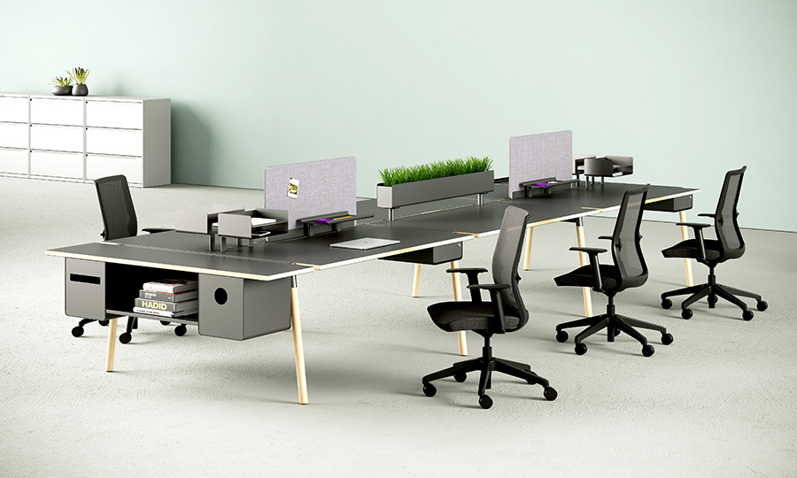
Inscape’s RockIt system—unobtrusive at first glance—is a fine example of smart simplicity, natural wood, and thoughtful detailing bringing warmth to an office.
Courtesy the designer and manufacturer
#6: Light & Action
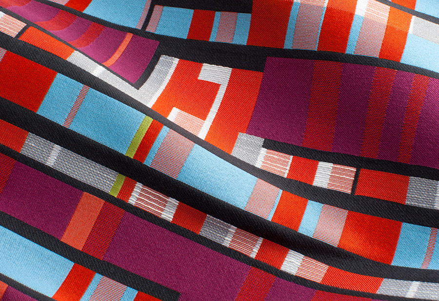
More manufacturers are moving away from polite neutrals and subtle patterns, instead embracing graphic elements to evoke energy and movement. New NeoCon releases express a strong preference for high-contrast colorways and large-scale pattern. Stanley Felderman and Nancy Keatinge’s collection for Momentum Group makes use of saturated color and bold geometries to create a sense of rapidly moving light.
Courtesy the designer and manufacturer
#7: Human-Centered Mechanics
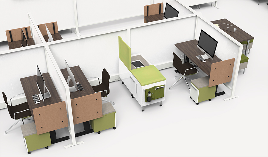
KI’s Tattoo office system puts power in the hands of the user—unlike most other modular systems, it requires no special tools or expertise to reconfigure.
Courtesy the designer and manufacturer

