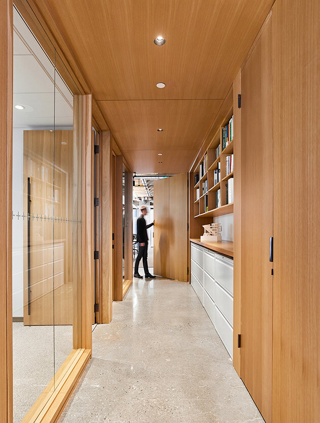
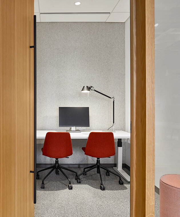
Andrew Frontini, design director and principal at Perkins and Will’s Toronto studio, shares the design strategy behind their office space
When Perkins and Will had the chance to design a new space for our office in downtown Toronto, we seized it the opportunity to capture and communicate our values and design ethos. The strength of any organization lies in its culture and this is particularly true of design firms. Our studio needed a space that would practice what we preach to our clients – that employee health, wellness, and engagement are the most important issues.
Community, culture, and connectivity became the driving themes of our design vision. Wellness, connection to nature (even in the heart of the city), and a low impact lifestyle, wove their way into all three themes. We wanted a space that would allow us to celebrate our community on a daily basis but also connect to a broader community of fellow designers, collaborators, and clients outside of our walls. We desired a space that would reinforce and communicate our design culture, but also shape it to be even more focused on wellness and sustainable practice.
From the outset, it was crucial to our principals that intermediate and junior staff were empowered to have significant input into the design. This involved extensive data collection regarding space utilization and working styles, along with visioning, interviews, piloting, and prototyping in our previous office.
A management group consisting of emerging designers from both our interior design and architecture practices oversaw the budget, the schedule and the delegation of day-to-day design work. Senior leadership provided critique and oversight but deliberately stayed out of the authorship role. This provided great growth and learning opportunities for our younger designers, but it also allowed fresh ideas and perspectives to come into play. Collective feedback led to overarching themes: to prioritize sustainable access, to strengthen connections to the city’s design culture, and to ‘walk the talk’ in an office that embodies green design excellence.
Prioritizing connectivity
As a result, the new studio location is in the heart of downtown Toronto, taking over the 12th floor of a mid-century modern building. The site was chosen specifically to minimize car travel, maximize transit and active transport options, and enhance the healthy amenities available to employees and visitors. The office is within 250m of two subway stations, one block from the city’s first transit-priority corridor and has bus stops and a bike lane right outside of the front door.
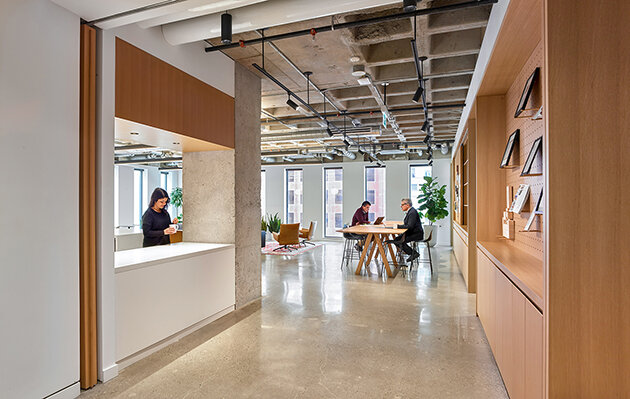
A direct connection to the below-grade PATH system provides access to a wide range of food and retail options, and year-round walkable access to much of downtown. The base building also provided us with an opportunity to leverage the raw qualities of its 1960s era architecture, to create an inspiring environment for our designers to work in.
Sustainability, health and wellness were core considerations at every scale of the project. In addition to location, access to natural light, active transportation options and abundance of city amenities at our doorstep, a forward-thinking program incorporated LEED V4 ID+C from the project’s onset. This included a rigorous approach to material selection. Every product used in the design was screened to exclude ingredients with known or suspected health impacts.
Perkins and Will maintain a precautionary list of materials to both help clients and change industry standards amongst manufacturers. The material selection process also considered environmental impact, prioritizing materials with regional, high-recycled content, sourced from FSC. The intentionally extensive use of wood on the project lowered the embodied carbon of the space as well.
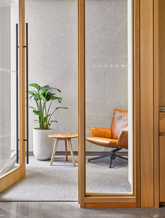
All of our projects take a holistic and interdisciplinary approach to sustainability. Our architects and interior designers forged the concept for the new office in collaboration with Zeina Elali, our studio’s senior sustainability advisor. Moreover, lush plantings and a variety of lighting styles bring a sense of nature and biophilia to a dense downtown location, and a healthy catering policy and green cleaning policy extend wellness into operations. During the construction phase, indoor air quality construction practices were also employed, regularly inspected, and documented to improve air quality at the time of occupancy.
Design for a new generation of talent
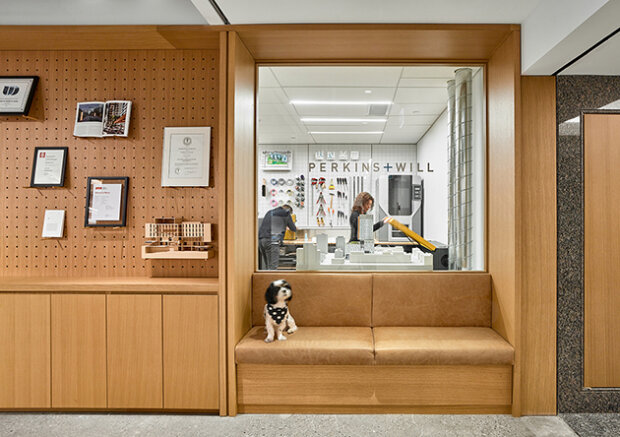
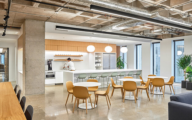
The biggest and most transformational aspect for our firm was how we designed the new space to support an agile workforce and the next generation of talent. To begin, the new studio flips the traditional office layout, bringing the kitchen and lounge to the front and providing a direct line straight into the real culture of the company, the moment you step off the elevator. With no formal reception desk and waiting area, everyone becomes a greeter.
We also minimized the office footprint but maximized multi-functionality. We went from 70 assigned desks (including 5 private or semi-private offices) and 66 collaboration seats to 54 free-address workstations, no private offices, and 119 collaboration seats. This design offers more staff and visitor capacity, more program variety, with double the number of spaces for focused and collaborative work, and more generous amenities – all within a footprint that is 25 percent smaller than our former studio. We embraced a free address working model, giving employees more autonomy to come and go as they please without the judgement of an empty desk.


