When office furniture startup Poppin decided to redesign its Flatiron District headquarters at 16 Madison Square West, it wanted its workspace to show clients how its furnishings and accessories work in a functional and stylish environment.
Last summer, the 10-year-old company set out to update its 8,600-square-foot office and showroom, which was dominated by a bright blue wall emblazoned with its motto, “Work Happy,” in white letters, along with stark orange and white walls in other parts of the space.
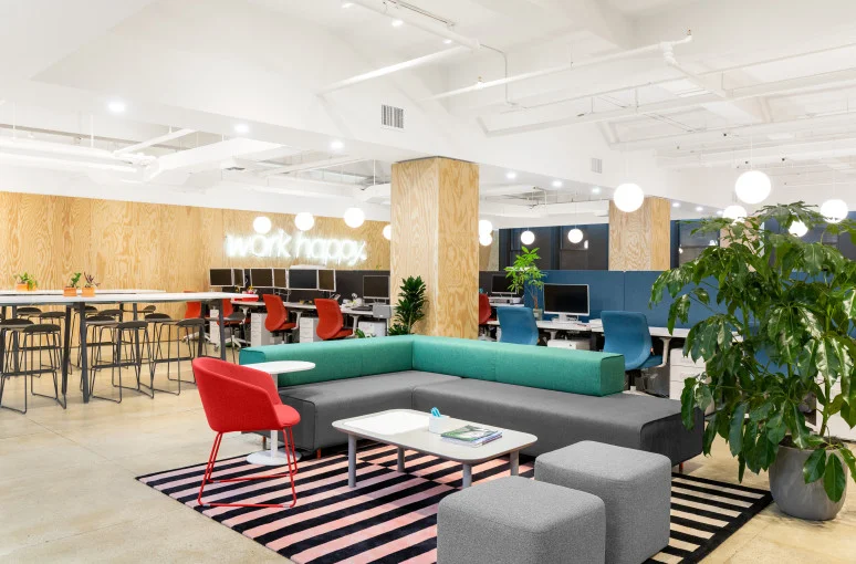
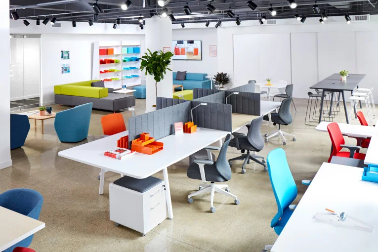
After a six-week renovation in July and August of 2018, the company’s offices have a sleeker, more modern feel. Armed with a modest budget of $200,000, Poppin product designer Matteo Bonacina decided to clad the walls in blond plywood and redo the “Work Happy” sign in white neon. The desk setup remained largely the same, except for the addition of dark gray and navy dividers running lengthwise along workers’ desks, but much of the common space for Poppin’s designers, programmers and salespeople was revamped.
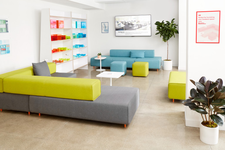
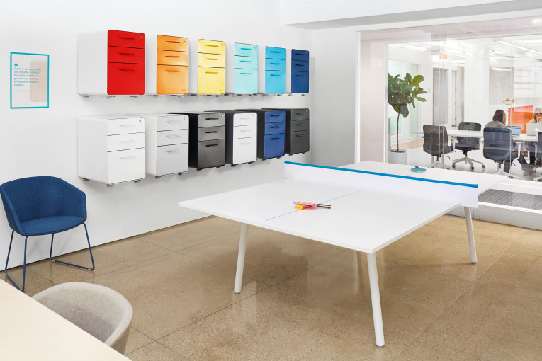
“We created different zones within the space without the need of walls,” Bonacina explained. “We have some glass partitions but for the most part we created different areas using Poppin furniture, from a desk to soft seating to little phone booths to conference rooms.”
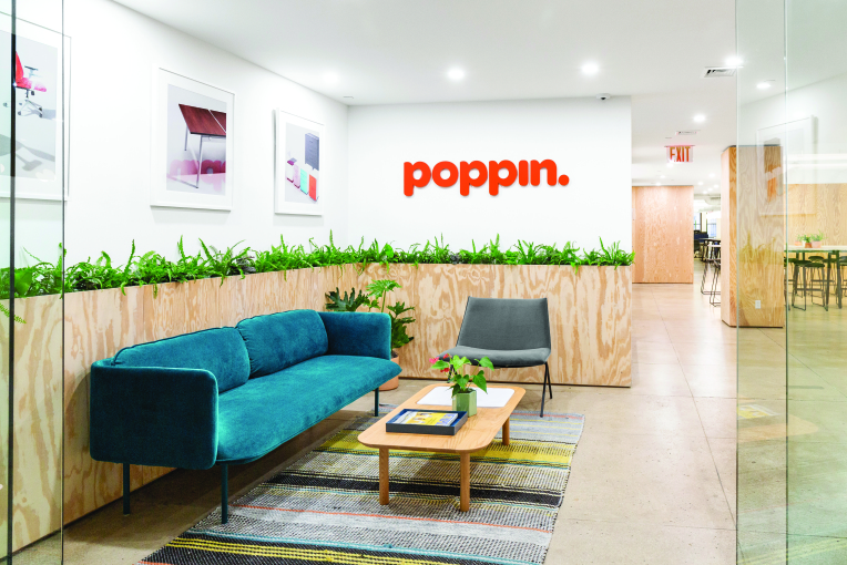
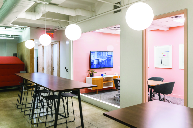
In the communal section of the office, one section is outfitted with a long white standing table and black stools, and another area has a gray and green couch, gray ottomans and a red chair. The seating is often an accent. There are bright red and blue chairs at workers’ desks, a grass green sofa “booth” with tall walls that allow for privacy, and a teal couch in the reception area, which is encircled by a waist-high plywood box potted with living ferns. Many of the design choices were made with an eye toward saving money.
“The materials we chose and the finishes we went with are budget conscious,” Bonacina noted. “We’re big on achieving great results and being mindful of how much that costs too. We as a brand make products and furniture that are really appealing and really accessible in terms of the price point.”
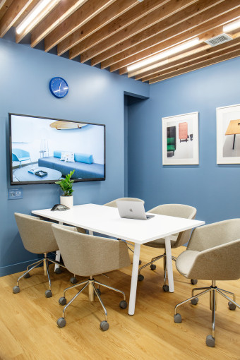
The conference rooms are a little more distinct. Each one has walls painted a different color—one is pale blue, another light green, a third in light pink—and accordingly named Slate Blue, Mint and Blush. Hanging bulb lamps illuminate much of the office, in an effort to give the place a more casual feel. Bonacina also chose warmer light bulbs for the main area—again, more like a home than an office—and cooler ones for the conference rooms.
“It was important for me and for our aesthetic to bring that warmth that we find in a residential space,” he said. “We all like going home, so why not bring home here?” He dubbed the aesthetic, which is reminiscent of many WeWork coworking spaces in New York City, “resi-mercial.”

