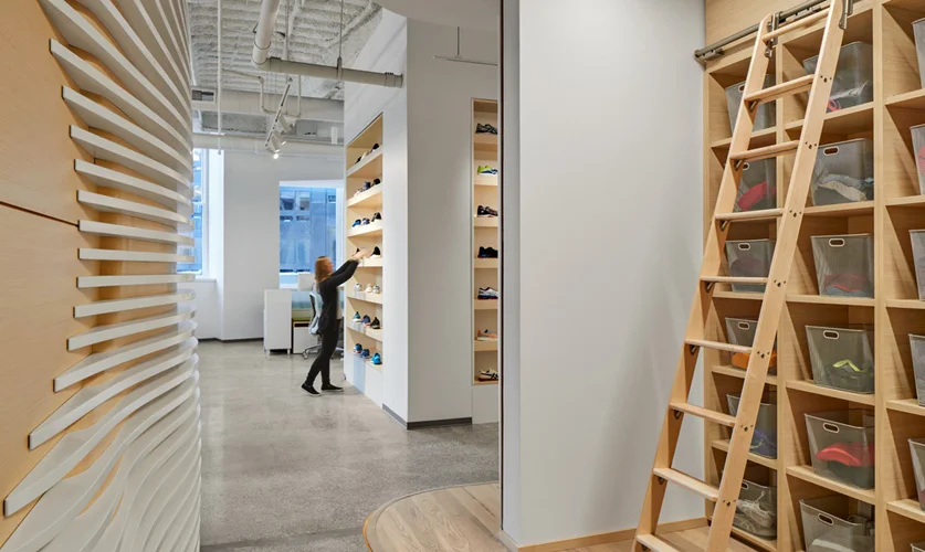
Trunk Club, Boston. Photo © Jared Kuzia Photography
When discussing the new store vision with a retail client, we often hear “it needs to be clean, modern, and Apple-esque.” A compliment to the Apple store aesthetic, but for our client and other retailers, what does that actually mean?
Apple introduced their 4,500-sq.-ft. store design concept back in May 2001, at Tysons Corner Center, in Virginia, with lots of fanfare. Think hardwood floors, large seamless glass storefront, museum-like gallery exhibits, parsons tables, genius bars, sleek monochromatic wall finishes, and trees. That design model has proven successful, along with Apple ingenuity.
2525 Main Street, Irvine, CA. Photo © Benny Chan
As store design evolves, it is increasingly evident that the desire to mass merchandise has abated. For consumers the “clean” store design model allows them to chart their own course without having to navigate through dense visual static. For retailers, the consumer preference for breathing room and simplicity allows for the “showcasing” or “showrooming” of products as heroes, with “play zones” (give it a try) and more focused areas to draw consumers in (see it here).
Additionally, the next generation of stores will integrate pressing agendas, for example the drive for community and diversity, and biophilic design to bring the outside in.
Gunlocke Chicago Showroom, Chicago.
This mindset works well for Apple and others like them who sell in tech retail and consumer electronic spaces. But it has also broadened out even beyond them, using online portals as stepping stones that draw consumers into brick and mortar. Products selected online can be prepared and available to consumers in a physical showroom environment—a place to go that promises experience and inspires loyalty.


