Global flooring designer Shaw Contract has released its list of winners of their 2018 Design Awards. Now in its 13th year, the programme honours architects and interior designers who push the boundaries of design and create impactful built environments. More than 500 projects were represented from 36 countries.
This year, a key trend revealed itself in the winning designs – the influence of home. All over the world, offices, schools, hotels and other commercial environments are exhibiting warm, comfortable vibes to bring the feeling of home, wherever visitors may be. Here’s a glimpse at the five winning projects – which all have a distinctly residential flavour.
David Jones and Country Road Group Head Office by Gray Puksand
This 400,000-square-foot Melbourne workspace, designed by local firm Gray Puksand, is home to a number of leading Australian fashion brands, including David Jones and Country Road Group. Gray Puksand used carpet tile to redraw the space – without detracting from the space’s natural light.
Instead of erecting walls to separate office features – which would impact light flow – the firm used vibrant grey carpet tiles to delineate collaboration zones. Without dividing the floorplate, the firm created what it calls “pavilions.” “As a design solution and a play on the concept of “pavilion,” the ceiling and floor surrounding the built form create two bold black planes, which visually ground the physical form, as well as being representative of the safety of ‘home,’ “ the firm says.
Habraken Rutten Office by Fokkema & Partners Architecten BV
Perched 25 floors above the city, real estate consulting firm Habraken Rutten has incredible views of Rotterdam. Accordingly, Fokkema & Partners Architecten BV designed the space around a muted colour palette, worn-looking materials and subtle graphical play to create an office that’s comfortable – but doesn’t detract from that million-dollar view. The material choices would fit just as easily in a condo.
“By adding a refined and balanced lighting plan, the Habraken Rutten office gives off a homey, atmospheric sensation, far from being a standard office,” the firm says. “The interior design carries the new, strong signature of Habraken Rutten, taking care of the smallest details. Wide corridors flank the building core and create comfortable, foyer-like spaces, encouraging chance meetings and informal interaction.”
Ellucian office by Gensler
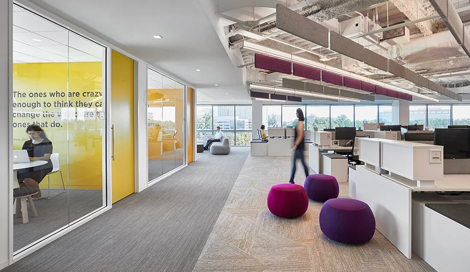
In open-plan offices, floor plan design can be critical. Accordingly, for Ellucian’s Reston, Va. headquarters in the Dulles technology corridor, multidisciplinary firm Gensler organized the office landscape using an array of colours and textures – including Shaw Contract’s Alchemy and Grounded Carpets. The result is an airy, three-storey space that’s both dynamic and collegiate.
It’s not without whimsy, either. “The second two-story hub is a staff-facing experience that represents a student’s eclectic social life and personal identity outside of the classroom,” says the firm. “A double height ‘scholars house’ and spiral stair anchors the space with amenities like foosball, shuffleboard and tufted lounge seating.”
Mercedes Me by Jackson Clements Burrows Architects
For its Mercedes Me concept store, the luxury car brand wanted a space that connected with a young, diverse audience – and one that valued Melbourne’s distinct local culture. To realize that vision, local architecture firm Jackson Clements Burrows created a unique environment with a living-dining space, an open-air garden, private booths, a library and a floating loft.
Jackson Clements Burrows envisioned the store as a twist on the Melbourne café, where people gather to socialize, play and work. For many city dwellers, the coffee shop is like a second living room. “Emerging from the brief came the idea of the home,” says the firm. “For many Melburnians, the local cafe is an extension of their lounge room: a home being a place where everyone finds their place.”
Playster Office by ACDF and Couper Croiser
The new 18,000-square-foot Montreal office for Playster, a subscription-based entertainment service brand, offers a stark contrast to the other award winners. But the presence of home is still strong in this ACDF and Couper Croiser project, as the colours and bright wayfinding used on the floor delineate identity and belonging. Each working group has its own “home,” identified by the colours seen on the floor (which also correspond to the hues in Playster’s branding).
“Reminiscent of the company’s logo, the blocks of colour on the walls and the carpets create a strong visual impact,” says ACDF. “In their progression, the different shades define specific zones spreading in a fluid movement.”
This content was published by Azure on behalf of Shaw Contract.


