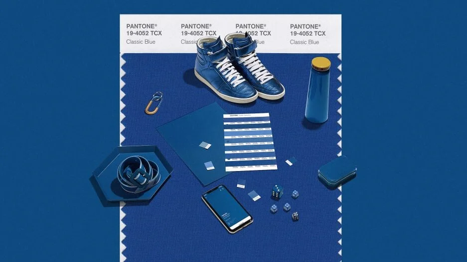
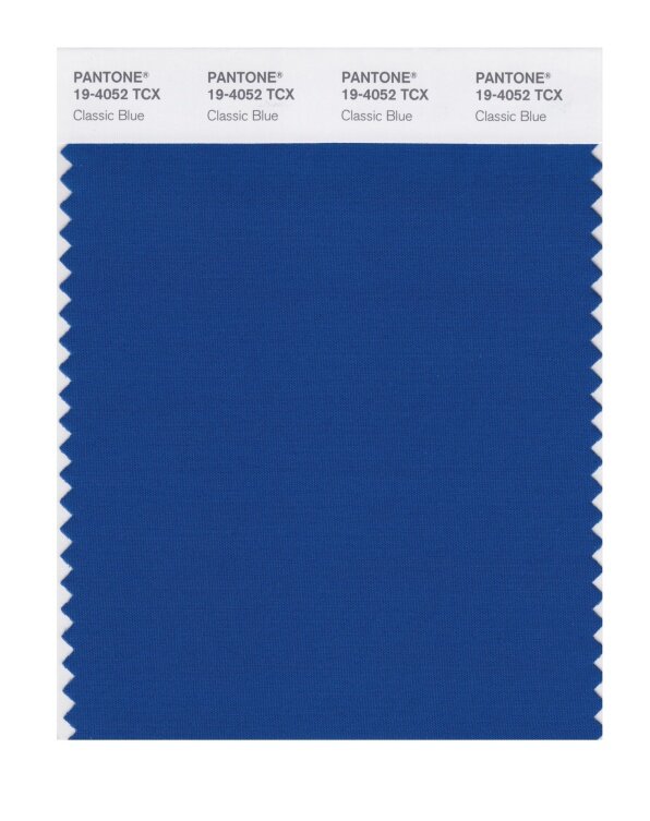
It’s the color of blue jeans, blueberries, and the sky at dusk. Pantone’s Color of the Year 2020 is Classic Blue. It’s what the color forecasters at Pantone have deemed to be a comforting, timeless color for a time of change.
“Many of us looked at 2020 as the future, but now we’re here,” says Laurie Pressman, VP at Pantone Color Institute. “Here” is an admittedly unstable place. Social media sucks our attention and breeds anxiety. We’re so connected, yet our relationships are suffering. Global politics is in great unrest as dictators make a comeback. The truth is being challenged by mass propaganda machines.
And amid all this, Pantone was faced with deciding which color best expressed the zeitgeist—a tradition now in its 20th year. “We landed back on the blue family, where we’ve been and where we are,” says Pressman. “Just not knowing where to go and who to trust…[blue is] the feeling of calm and reassurance that help us have that confidence to move forward.”
All of this psychology might sound familiar: Pantone’s 2019 Color of the Year, Living Coral, was “comforting and energizing at the same time, a color meant to serve as a salve in a time of global uncertainty,” as Co.Design reported last year. Classic Blue is in many ways a product of the same core observation.


